Colour matching in textile printing: strike-offs and light
Two people can look at the same printed swatch and disagree about the colour. A shared standard, the right light and a clear tolerance settle the question.
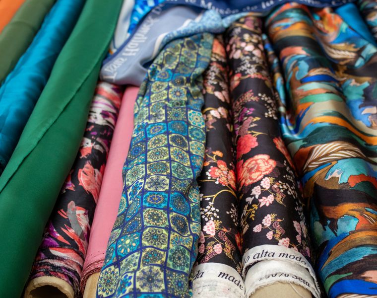
Colour is where most disagreements about printed fabric begin. The designer saw one shade on screen, the buyer approved another on paper, and the fabric looks different again in the shop. The industry deals with this through a simple discipline: one physical standard, an agreed light source, a sample on the real cloth and a stated tolerance.
Start with a physical standard
A screen is not a colour standard. Monitors vary, and a colour on a screen is made of light, while a colour on fabric is made of dye or pigment reflecting light. The reference should be a physical object: a Pantone textile (TCX) chip, an approved fabric swatch from a previous order, or a sample of the buyer's own. Keep the standard clean and out of the light, because a faded reference moves the target.
Lab dips and strike-offs
For a piece-dyed fabric, the dyehouse makes lab dips: small swatches dyed to one or more recipes, submitted side by side against the standard. The buyer picks one, or asks for a correction, and that dip becomes the reference for bulk dyeing.
For a printed fabric, the equivalent is the strike-off: a length of the design printed on the actual production cloth, fixed and finished in the same way as bulk. A strike-off shows colour, scale, repeat and hand together. Several colourways can be printed side by side on one strike-off, which speeds up the choice.
A strike-off on a different cloth is only a guide. Panama, poplin, drill and canvas each take and reflect colour differently, and the same file prints lighter or deeper depending on the weave and preparation.
The right light
Colour must be judged under a known light, ideally in a light cabinet that offers several standard sources:
| Source | What it imitates | Typical use |
|---|---|---|
| D65 | Average north-sky daylight, about 6500 K | The main reference for most approvals |
| TL84 | Tri-phosphor fluorescent store lighting, about 4000 K | European retail lighting |
| CWF | Cool white fluorescent | Some North American retail lighting |
| A (incandescent) | Warm tungsten home lighting, about 2856 K | Home textiles seen in the evening |
Agree the primary source and one secondary source with the supplier. Looking at a sample by a window or under office lights gives a different answer every time.
Metamerism
Two colours can match perfectly under one light and not under another. This is metamerism, and it happens because the sample and the standard are coloured with different dyes or pigments that reflect light differently across the spectrum. A printed fabric matched to a paper chip, or a pigment print matched to a reactive one, is especially prone to it.
That is why a match is checked under at least two sources. A close match under D65 that shifts noticeably under TL84 is a warning, particularly for a product sold in shops lit with fluorescent light.
Tolerance and measurement
Visual assessment is normally backed by a spectrophotometer, which measures the colour and calculates the difference from the standard as a Delta E value, commonly using the CMC or CIEDE2000 formula. A tolerance around 1.0 is common for solid shades. Numbers do not replace the eye, but they make the conversation objective and let the same standard be used from one order to the next.
A clean approval process
- Send one physical standard per colour, with a code.
- State the light sources and, if you use one, the Delta E tolerance.
- Approve a strike-off on the production cloth, and keep a signed cutting as the bulk reference.
- Allow for small, normal variation between lots, and ask for a shade band if you will reorder.
Our reactive and pigment digital printing are both suited to fast strike-offs on our own cotton qualities. Send us your standard and the fabric you intend to use.