From colour reference to print: textile colour codes in printing
A textile colour code is a shared language between designer, buyer and printer. Used well, it cuts correction rounds. Used carelessly, it promises a shade the process cannot reach.
Most designers and buyers specify colour by a code from a textile colour reference system. The best known is Pantone's Fashion, Home + Interiors system, whose cotton chips carry a TCX suffix; other systems, such as Coloro, follow the same idea. A code gives everyone a single, physical target. It does not, on its own, guarantee that a printer can hit that target on a particular cloth with a particular ink set. Understanding how references move into print makes the conversation shorter and the result closer.
How the codes are built
Textile reference codes are organised around the way people describe colour. In the Pantone textile system, a number such as 19-4052 is read in pairs: the first pair gives lightness, from light at 11 to dark at 19, the second pair places the hue around the colour wheel, and the last pair gives the chroma, or strength. Neighbouring numbers are neighbouring colours, which helps when asking for a shade "a little cleaner" or "a step darker".
The suffix matters as much as the number. TCX chips are dyed cotton; TPX and TPG are printed on paper. The same number on paper and on cotton will not look identical, because the two materials reflect light differently.
Why a cotton reference is best for cotton
For printing on cotton, a cotton reference is the right starting point. It shows the colour on a textile surface, with the slight texture and matt look of dyed fibre, so the comparison with a printed strike-off is fair. A paper chip, a screen colour or an RGB value in the design software are useful for communication, but none of them is a reliable standard for fabric. When a colour is specified only by a paper code, ask the designer whether a cotton reference exists, or send a physical sample of the target.
Chips also age. Light, handling and dirt shift them, so keep references closed, clean and replaced from time to time. A faded chip moves the target for everyone.
From reference to ink
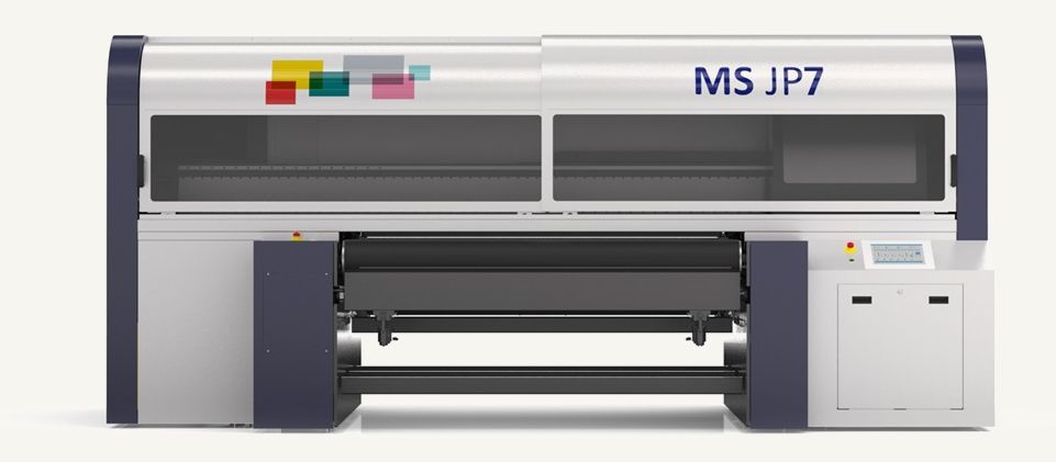
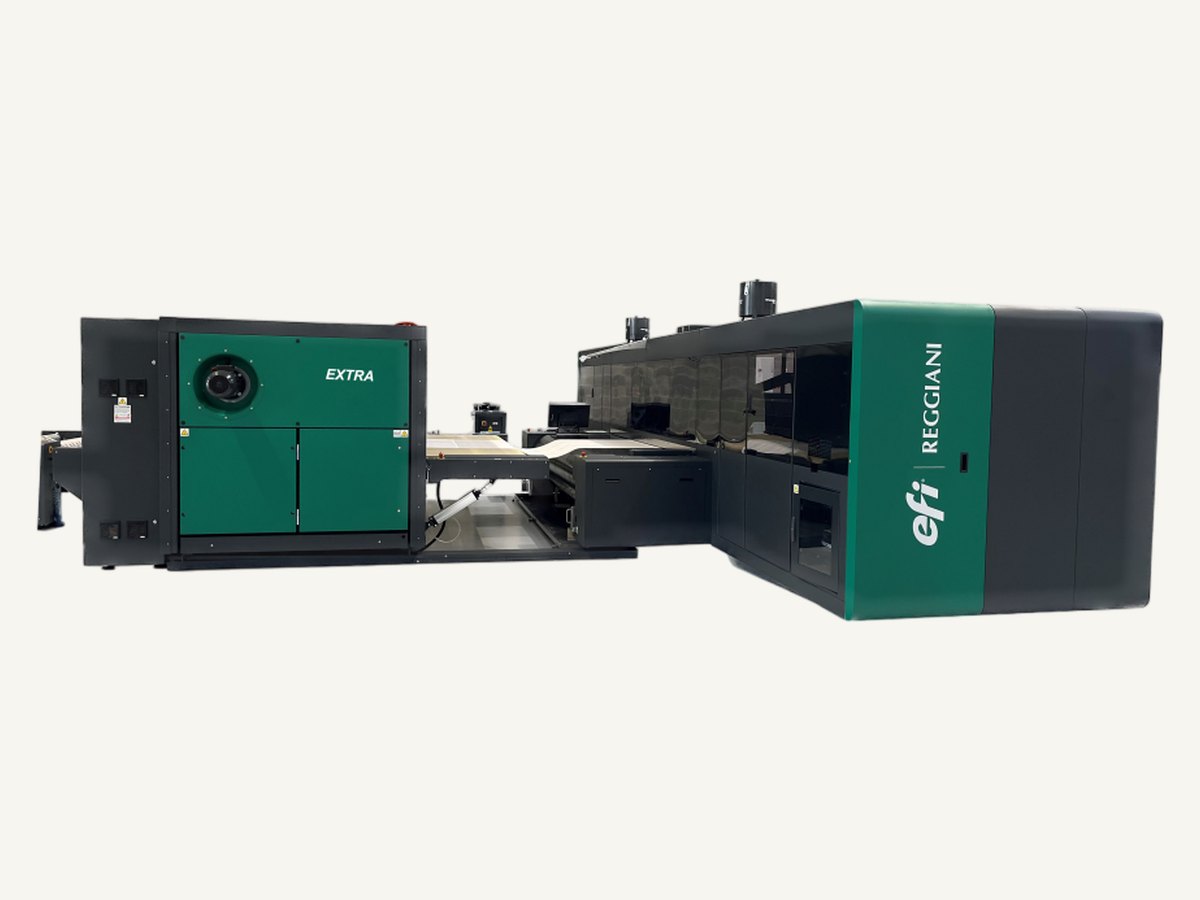
A digital textile printer mixes its colours from a limited set of inks, and each ink set on each cloth has a gamut: the range of colours it can reproduce. Most textile reference colours fall inside that range, but some do not. Very bright, highly saturated shades, some clear turquoises, oranges and violets, and very deep neutrals can sit at or beyond the edge. The practical route is:
- The printer builds a colour library for each quality and ink set by printing charts on the real cloth and measuring them.
- Each reference is matched to the closest printable recipe, often with a small set of alternatives printed side by side.
- The buyer chooses from a strike-off, and the chosen recipe is stored against the reference and the fabric code.
For that reason a design file should carry colour names or codes for key shades, not only pixel values. The printer can then replace each named colour with the matched recipe rather than guessing from the screen.
Method and base change the result
Reactive dyes and pigments reach colour differently. Reactive printing gives the deepest, most saturated shades on cotton, which suits dark and rich references. Pigment printing reaches most references well, with slightly less depth on the darkest shades. The base cloth also matters: a smooth poplin shows a colour cleaner and slightly deeper than a textured panama, even from the same recipe. A reference is always matched on a named fabric, and the match does not transfer automatically to another.
Piece dyeing works differently again. A dyehouse can build a recipe from many dyes, so solid shades can usually be matched more closely than in print, where every colour has to come from the same ink set.
What to send
- The reference code with its suffix, and a physical chip or sample for key colours.
- Which colours are critical and which may move slightly.
- The fabric code and the printing method, if known.
- Named colours in the file, matching the references.
With that, the first strike-off is usually close. Send us your references and the fabric you intend to use, and we will print a colour check on that quality.